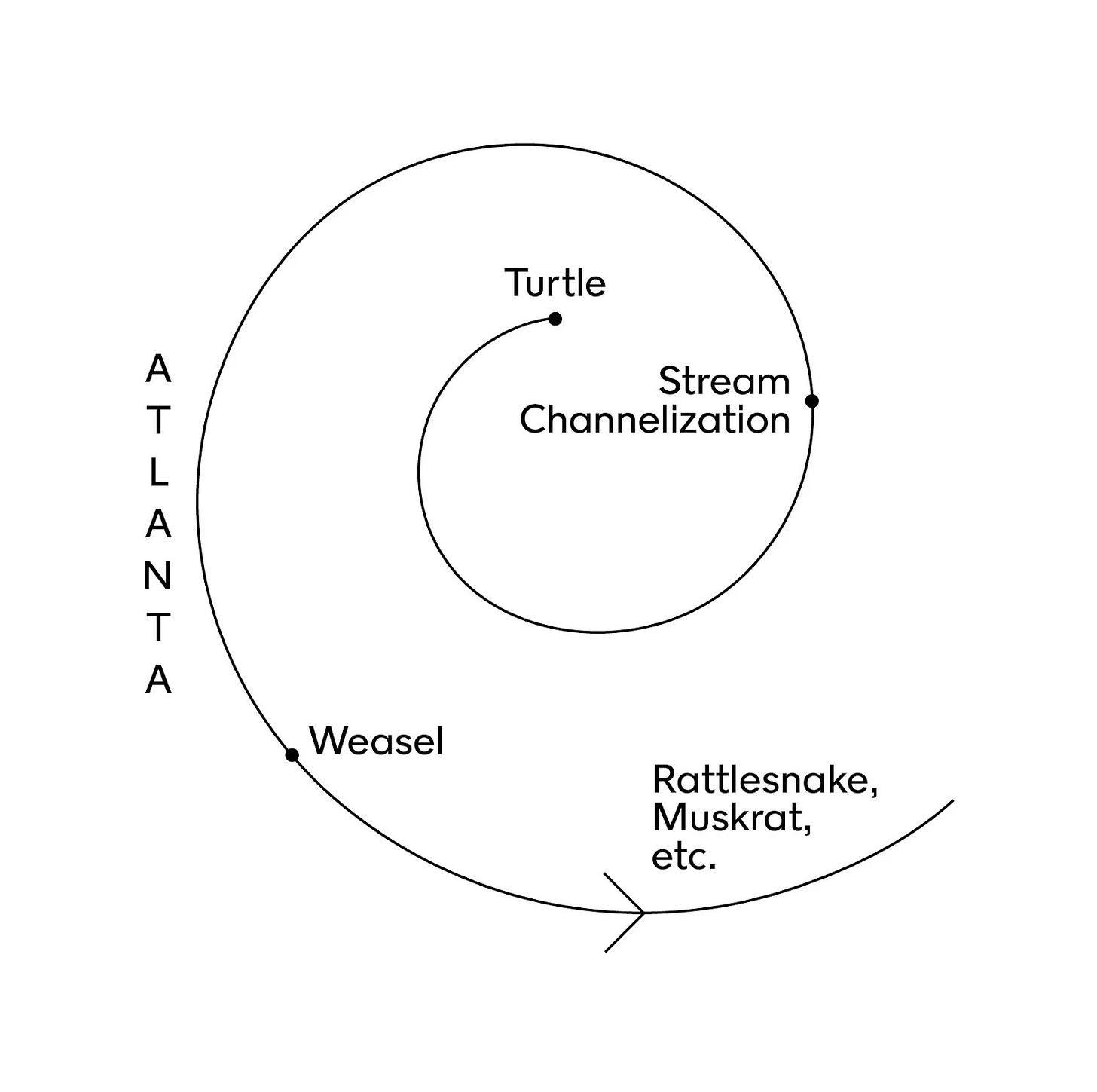
Noah here. I was recently reminded of this excellent New York Times Magazine profile of the writer John McPhee. McPhee, as I’m sure some of you are aware, is a journalist and writing professor at Princeton who is considered one of the leading voices of literary/creative nonfiction. He’s written books that range from the retelling of a single 1968 tennis match, to a book-length profile of Bill Bradley’s time at Princeton, to the story of a conservationist and his three enemies. In 2017 he came out with a book called Draft No. 4 which outlined his writing process, including his unique approach to outlining his stories, which the Times story illustrated well:
This inscrutable pictogram turned out to be the structure of a 1973 New Yorker essay called “Travels in Georgia,” in which McPhee describes a long road trip with ecologists who, among other things, eat roadkill. (“Weasel,” in the diagram, refers to the time McPhee ate one.) The piece is one of McPhee’s early magazine masterpieces, its language lovely (“The darkness in there was so rich it felt warm,” he writes of a swamp) and its characters almost unbelievably vivid. (“She had a frog in each hand and saw another frog, so she put one frog into her mouth while she caught the third.”) Like much of McPhee’s work, it sits at some thrilling intersection of short story, essay, documentary, field research and epic poem.
Why is this interesting?
First and foremost, I’m a sucker for this sort of stuff. As someone who likes to write, it’s fascinating to understand the process followed by one of the best in the business. It’s not just nice-looking graphics either, McPhee is a treasure trove for this kind of insight: Such as his unique dictionary usage or custom-built word processor.
Beyond that, though, there’s a particularly interesting thread to pull on around how you visualize stories. Kurt Vonnegut spent a good amount of time thinking about this as well, though his approach was quite different than McPhee’s.
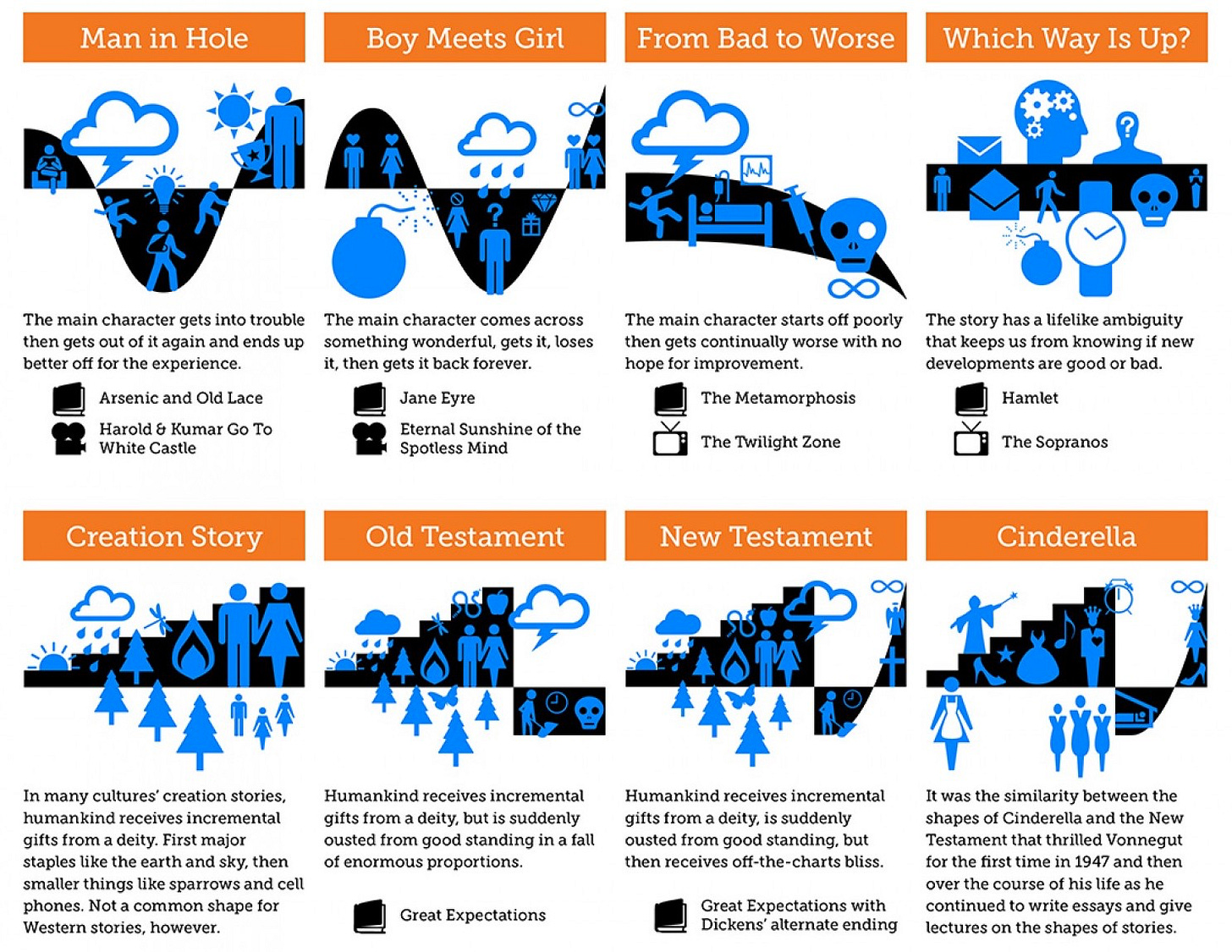
All stories, Vonnegut argues, can be plotted against a Y-axis of good and ill fortune and an X-axis of time, from beginning to end. Most stories follow a few familiar arcs: Man falls in hole, starting high in good fortune, before dipping low into ill fortune, and then climbing back up to good fortune, ending a bit above where he started. Cinderella, on the other hand, starts low in ill fortune and climbs her way up to good fortune only to fall back down until she finally escapes into a long life above the line. A graphic designer named Maya Eilam took the time to chart these out much more neatly than Vonnegut bothered (via OpenCulture):
The exception to this rule? Hamlet. As Vonnegut charts it, the story is a straight line that starts in ill fortune and never really goes up or down. At each major turn, we’re left to wonder whether the news is good or bad. This, in Vonnegut’s view, is why the story is a masterpiece: “We are so seldom told the truth. In Hamlet, Shakespeare tells us that we don’t know enough about life to know what the good news and bad news is and we respond to that. Thank you, Bill!” (NRB)
Quick Links:
This Complexity Podcast episode with Dmitri Tymoczko on geometry and music is excellent. (NRB)
WITI x McKinsey:
An ongoing partnership where we highlight interesting McKinsey research, writing, and data.
Saying no could advance your career. When was the last time you were asked to take on non promotable work? Handling tasks or assignments that help your organization but not your career can have a profound effect on women’s jobs and lives. In a new Author Talks interview, Lise Vesterlund explains why women so often agree to it—and how they can say no.
—
Thanks for reading,
Noah (NRB) & Colin (CJN)
—
Why is this interesting? is a daily email from Noah Brier & Colin Nagy (and friends!) about interesting things. If you’ve enjoyed this edition, please consider forwarding it to a friend. If you’re reading it for the first time, consider subscribing (it’s free!).


