Noah here. It seems reasonably safe to assume that WITI readers are largely familiar with Kyle Chayka’s AirSpace concept, but in case you’re not, it’s a way to describe the modern aesthetic coined a few years ago:
It’s the realm of coffee shops, bars, startup offices, and co-live / work spaces that share the same hallmarks everywhere you go: a profusion of symbols of comfort and quality, at least to a certain connoisseurial mindset. Minimalist furniture. Craft beer and avocado toast. Reclaimed wood. Industrial lighting. Cortados. Fast internet. The homogeneity of these spaces means that traveling between them is frictionless, a value that Silicon Valley prizes and cultural influencers like Schwarzmann take advantage of. Changing places can be as painless as reloading a website. You might not even realize you’re not where you started.
As someone put to me recently, AirSpace is essentially the Brooklynification of the world. When we think of AirSpace brands we obviously think of companies like AirBnB and Blue Bottle, but the concept is so pervasive that it's harder to think of a space or brand that doesn’t chase those lines than one that does.
Why is this interesting?
One of my favorite marketing stories to tell is about how when I was working at an agency early in my career we were doing research for one of the big consumer electronics companies. Specifically, we were testing a new commercial another agency had put together. The commercial was “edgy” (it had snowboarders!) and got high marks from all the random consumers who got pulled into a room in the mall to watch it. At least until they were asked the final question of “What brand was it for?” Nearly all answered with the name of the company’s biggest competitor. The moral is simple: after all that time and money, a commercial had effectively been made for another company. (One of the most well-known stories of this is the famous ad with a gorilla tossing around soft-sided luggage which was for … American Tourister.)
In Byron Sharp’s book How Brands Grow he talks a lot about ownable brand assets. These are the colors, iconography, and, increasingly, aesthetics that consumers associate with a single brand. The examples are endless: Tiffany’s has blue, Hermès orange, and UPS brown. Starbucks has the mermaid, Pepsi’s yin-yang, and McDonald’s golden arches. Coca-Cola has red, Spencerian script, polar bears, and Santa Claus (seriously, click through on that last one, it’s pretty amazing). There’s some evidence that the more unique assets a brand owns, the more valuable it is.
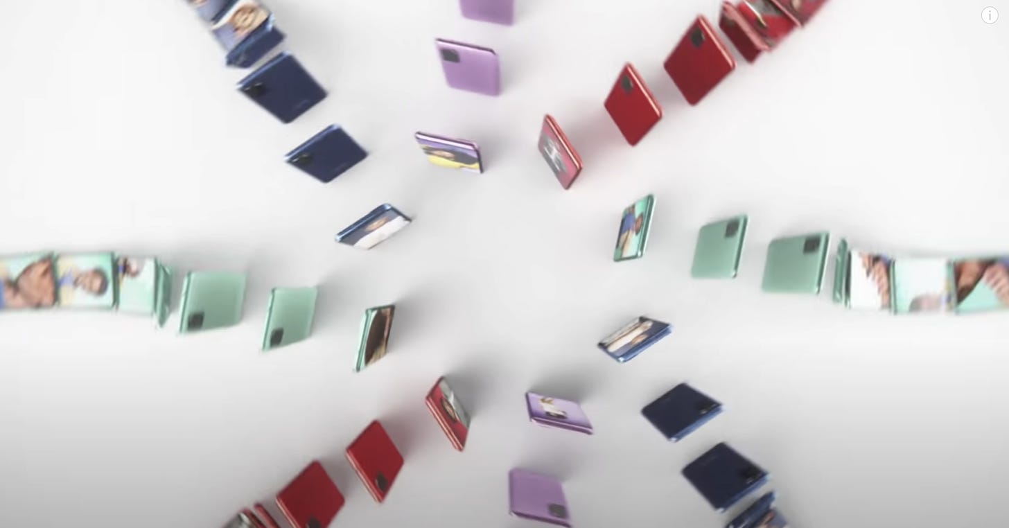
Still from an ad that IS NOT from Apple
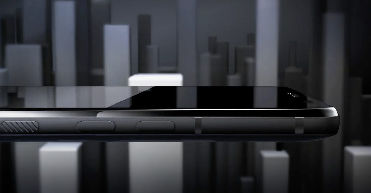
Also not an Apple ad
As impressive as all those brands are, only one can truly lay claim to owning AirSpace: Apple. If a set designer were trying to make a space look modern, what kind of computer would the character be using? But the aesthetic goes far beyond interior design. Think about all those phone ads that attempt to display a large-screened smartphone in a minimalist aesthetic. Not only do their phones look like iPhones, but so do their commercials. If you were to quickly look you would assume it was an Apple ad, right? The world has become one big marketing campaign for the world’s largest company.
(PS - I am breaking one of my cardinal rules of marketing writing by citing Apple as an example. Brands like Apple—of which there are few to none—are over cited and nearly impossible to emulate. But I’m giving myself a pass on this one because at least the suggestion is that others should take fewer cues from the world’s best brand, not more.) (NRB)
Mix of the day:
We always love it when Radiohead’s Thom Yorke trades the guitars for decks. He plays stuff you wouldn’t expect, and it is an interesting look into inspiration from one of the most interesting minds in music. Here he stitches up everything from Mark Pritchard to Errorsmith to the Fall. (CJN)
Quick Links:
The healthiest breakfast on the planet (CJN)
Obit for Christopher Plummer (CJN)
Loving collection one for 2021 from Drake’s (CJN)
Thanks for reading,
Noah (NRB) & Colin (CJN)
—
Why is this interesting? is a daily email from Noah Brier & Colin Nagy (and friends!) about interesting things. If you’ve enjoyed this edition, please consider forwarding it to a friend. If you’re reading it for the first time, consider subscribing (it’s free!).


We had (it's a bit passé) a term for this in Paris: Oberkampfisation. Like Brookyln, the area around the rue Oberkampf in the 11th arrondissement was formerly industrious and industrial (la maison des métallos!) with some really nice old-time cafés (the café charbon featured in many a movie).
Reminded me of this article: https://www.bloomberg.com/opinion/articles/2020-09-07/welcome-to-your-bland-new-world-of-consumer-capitalism