Why is this interesting? - The Norman Door Edition
On expectations, affordances, and user experience design
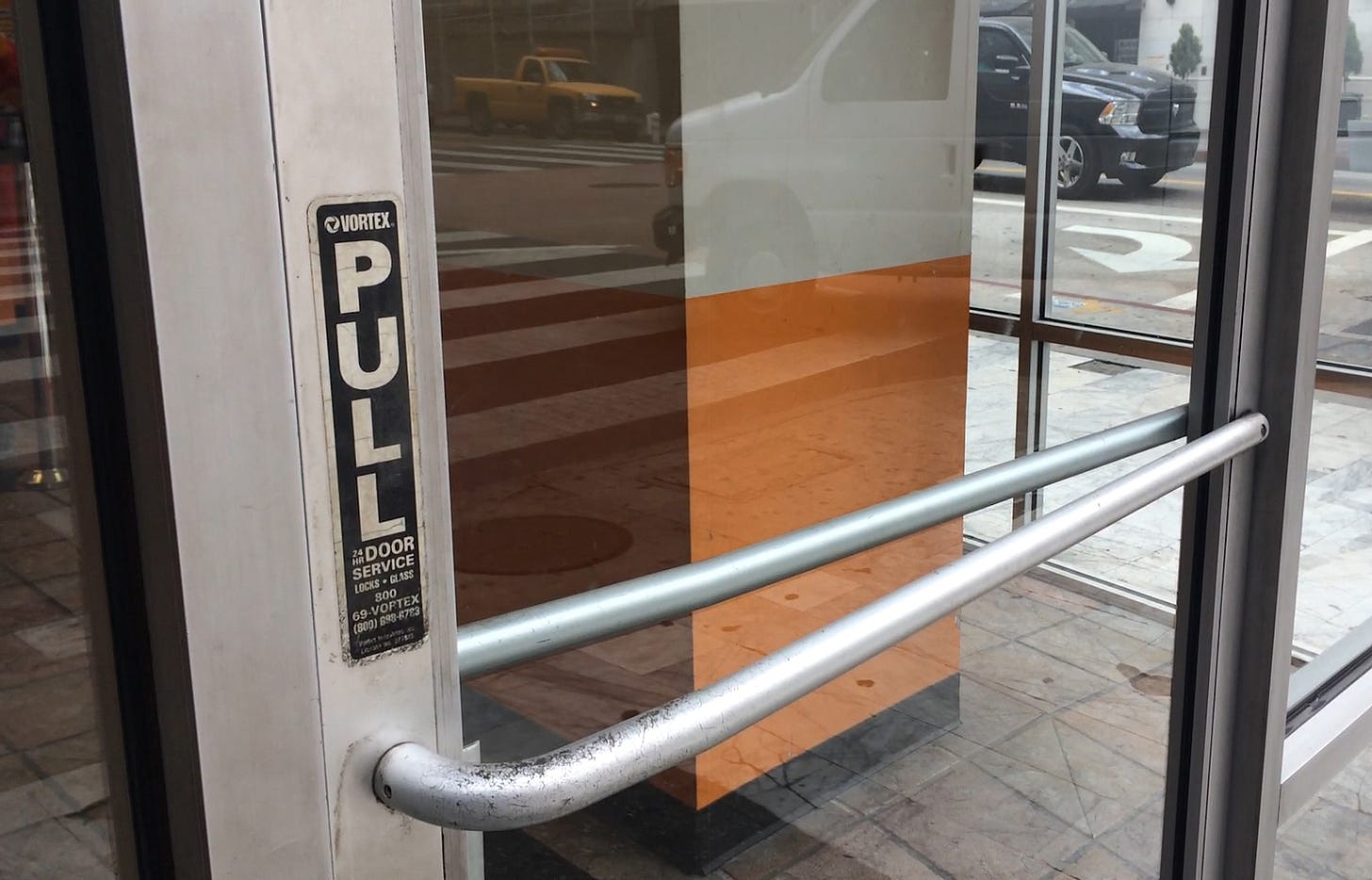
Noah here. One of the most famous books in the design world is called The Design of Everyday Things by Don Norman. Norman is a giant in the field of user experience and was an early (if not the first) user experience designer at Apple. He’s also well-known for having a lot of trouble opening doors:
If I were placed in the cockpit of a modern jet airliner, my inability to perform well would neither surprise nor bother me. But why should I have trouble with doors and light switches, water faucets and stoves? “Doors?” I can hear the reader saying. “You have trouble opening doors?” Yes. I push doors that are meant to be pulled, pull doors that should be pushed, and walk into doors that neither pull nor push, but slide. Moreover, I see others having the same troubles— unnecessary troubles. My problems with doors have become so well known that confusing doors are often called “Norman doors.” Imagine becoming famous for doors that don’t work right. I’m pretty sure that’s not what my parents planned for me. (Put “Norman doors” into your favorite search engine—be sure to include the quote marks: it makes for fascinating reading.)
His point, of course, is that good design needs to build on existing mental models. “Two of the most important characteristics of good design are discoverability and understanding,” he writes. “Discoverability: Is it possible to even figure out what actions are possible and where and how to perform them? Understanding: What does it all mean? How is the product supposed to be used? What do all the different controls and settings mean?”

Why is this interesting?
First and foremost, I’ve now infected all your brains. You will no longer be able to encounter a “Norman door” (like the one pictured above) without getting annoyed that someone somewhere didn’t care enough about you to make sure the thing worked the way it looks like it should. Per a New York Times Magazine article about the book:
Norman was inspired to write his book during a sabbatical he spent at the Applied Psychology Unit (A.P.U.) of the British Medical Research Council. At the A.P.U., Norman, who now directs the Design Lab at the University of California, San Diego, was struck by the paradox of working alongside design experts while surrounded by, among other things, poor signage, confusing light switches and, yes, wonky stovetops. Exasperated with how ordinary objects can induce self-doubt and embarrassment in their users, Norman felt it necessary to codify even the simplest features of design. “The human mind is exquisitely tailored to make sense of the world,” Norman writes, but flawed design sends us scrambling down a trail of “false clues,” ensnaring us in a spiral of rationalization and explanation.
Beyond the meme, I was thinking about other interactions that qualify for similar labeling. It’s the knobs and buttons that appear frequently enough that we have figured out how to use them effectively, but they still stymie us in various ways. In the physical world, one of the most obvious candidates is the door open/close button on elevators. It’s a button you often look for in a rushed moment and it’s icons of <> and >< most commonly don’t immediately register in your brain (or at least mine) as clear indicators of which is which (even as I look at them here it takes a minute). And, of course, many of the door close buttons aren’t even connected, so it doesn’t matter anyway.
In the end, this comes down to something Norman calls “affordances”. “An affordance is a relationship between the properties of an object and the capabilities of the agent that determine just how the object could possibly be used. A chair affords (‘is for’) support and, therefore, affords sitting,” Norman explains. Affordances guide the way we interact with the world and sit at the center of physical and digital design. The more something works like we have experienced it working in the past, the more likely we are to be able to master it quickly.
This obviously can get tough in the digital world, where we frequently encounter types of interactions that could never exist physically. But even in that universe, it’s critical to start by trying to find the patterns that guide expectations and build on them whenever possible. When that’s done well we click where we are meant to and when it’s overdone we get skeuomorphism, or interfaces that bears some useless resemblance to the analog version that inspires them (think of the page flip animations in lots of older reading and writing apps). Great digital product design finds smart ways to build on affordances and also knows when to try and invent new ones. Or, as my UX-obsessive friend Justin likes to say, familiarity is the quickest path to usability, but it's not always the best solution. (NRB)
Book of the Day:
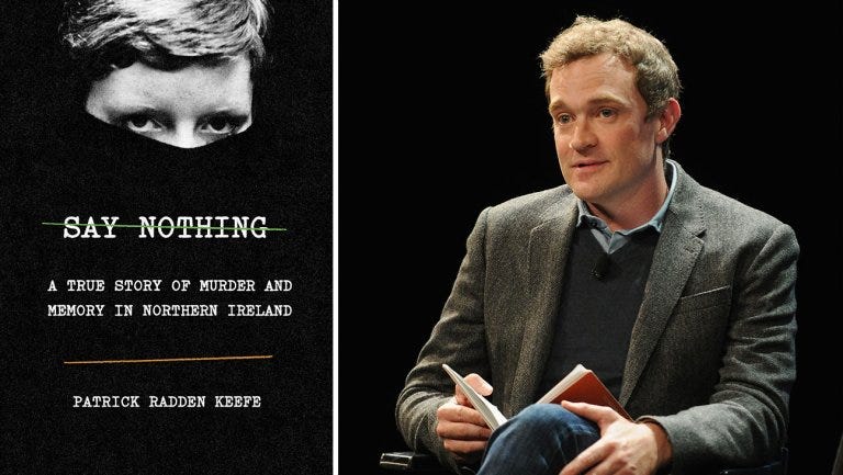
I wrote about the book, Say Nothing, in WITI earlier this year, but wanted to formally recommend it to people who have recently started reading the newsletter. Patrick Radden Keefe is a masterful researcher and brings new facts that illustrate the Troubles in Northern Ireland. His reporting was assisted by a very secret series of documents held under lock and key at Boston College as part of an oral history they began developing in the early 2000s. In addition, he got people to talk that had kept their lips sealed for a long time. As the book title suggests, these were people that would normally say nothing. One of the best reads of the year for me. (CJN)

Quick Links:
China is cornering Africa’s e-commerce market (FT Paywall) (CJN)
Seeing what Bill Cunningham saw (CJN)
These Gummies equal 6 cups of Spinach (CJN)
Thanks for reading,
Noah (NRB) & Colin (CJN)
PS - Friend of WITI Steve Bryant (4/22 - Maslow Edition) is looking for a full-time content strategist to join his Brooklyn-based team at Article Group. “Experience overseeing content requirements, conducting content audits, performing gap analyses, and building client presentations is a must.” If you are that person or know someone who is, please make sure to mention you found the job here. Steve said he’d buy us dinner if we help him find someone.
Why is this interesting? is a daily email from Noah Brier & Colin Nagy (and friends!) about interesting things. If you’ve enjoyed this edition, please consider forwarding it to a friend. If you’re reading it for the first time, consider subscribing (it’s free!).


