Noah here. One of the societal effects of COVID is that it’s forced many of us to tune our personal risk assessment tools. You’ve obviously got decisions that have turned political—like masks or no masks—but even the small choices on whether to eat outdoors, see a friend for a walk, or venture into the grocery store comes with a set of thoughts on the likelihood of catching the “new virus,” as my five-year-old calls it. While each of us is willing to take on different levels of risk, I haven’t met anyone who is oblivious to the process of deciding what’s acceptable and what’s not.
All of this has me thinking a lot about how we make these kinds of assessments. There’s obviously one component that is purely about understanding what makes one scenario more dangerous than another. At this point, we have enough information to understand that the intersection of what Japan calls the “three C’s” (closed spaces, crowded places, and close-contact settings) presents the highest likelihood of contracting the virus. Of course, we need to also layer on the current infection rates and testing status in our area as well as age and pre-existing conditions. Somewhere in there, you get a kind of risk in a vacuum model that can help guide behaviors.
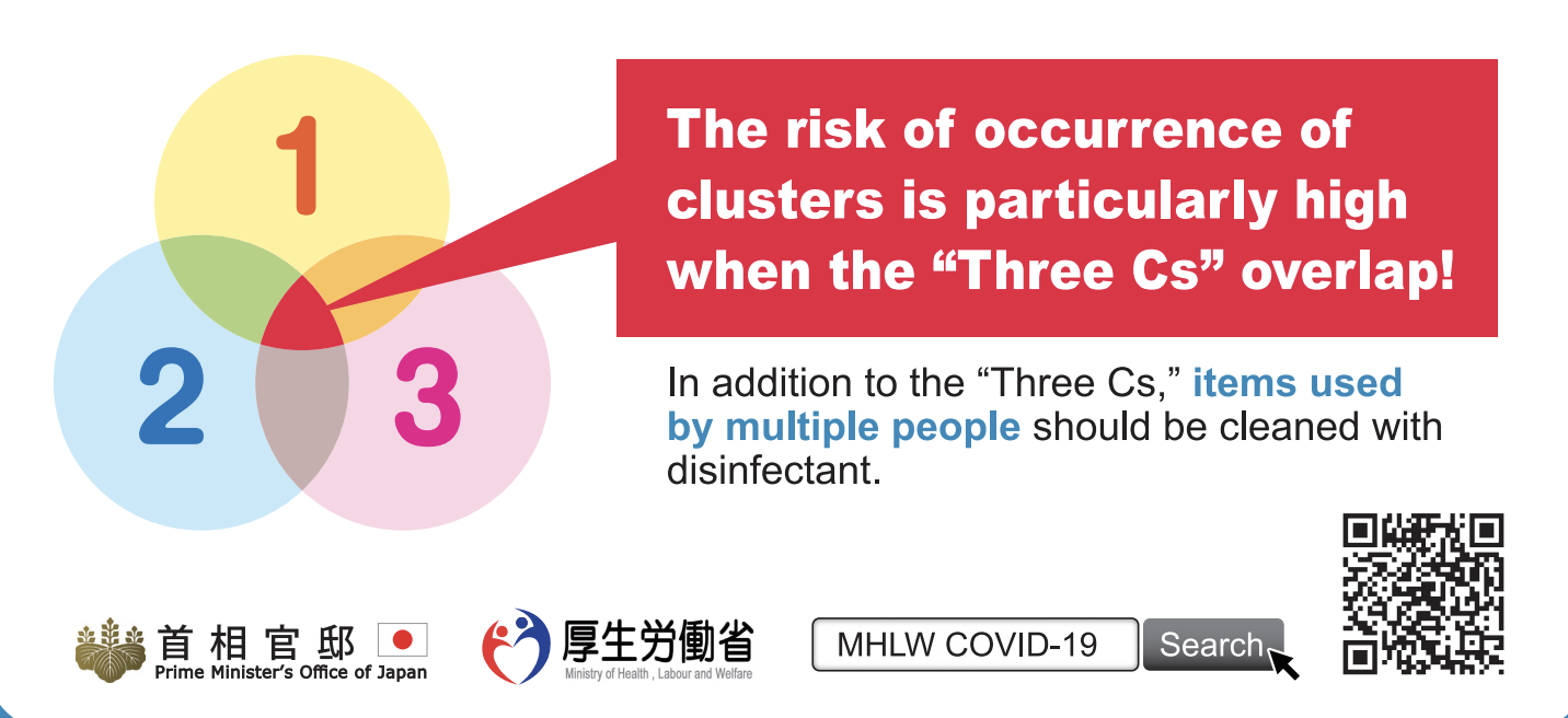
Detail from a Japanese COVID information notice.
But that’s only the minimum. Because you’ve also got to figure out the impact of interventions. Those include the things you choose to do to protect yourself and others, like wearing a mask, but also the choices of those around you, and any environment you’re interacting with. This can range from simple precautions like masks to more complicated ones like building ventilation patterns. Between a baseline risk model and an understanding of intervention usage and effectiveness, we can get to a reasonably good place in deciding what and where we are most and least likely to contract COVID.
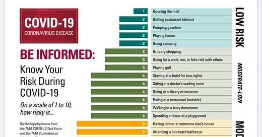
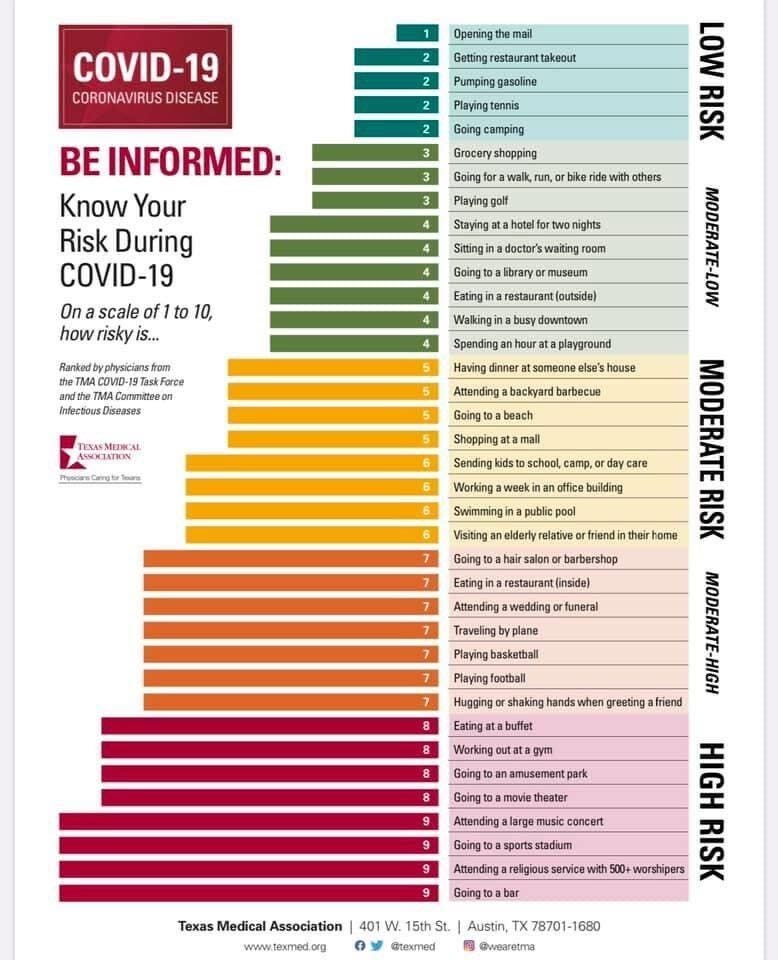
All that work gets us something that looks like the chart below, which you’ve surely all seen a variant of at this point. It’s a simplistic view of what is least and most risky to be doing in our current COVID environment.
Why is this interesting?
The problem with the above approach is that by only representing risks we are oversimplifying questions of existence to a point where they no longer make much sense. That’s because the things we do also have benefits, which must be taken into account. Sometimes those benefits are simple to understand and pretty consistent across groups—think about basic Maslow stuff like food and shelter—and sometimes they’re not: after months of working and watching kids with little outside interaction, a parent may feel like a massage is a critical bit of self-care. When it comes to benefits, we get into deep-seated individual differences that only we could really know.
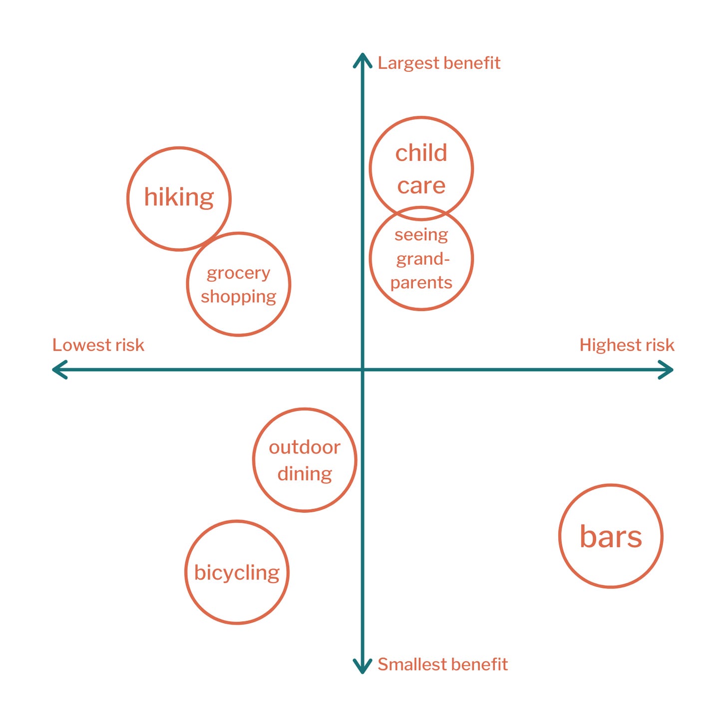
When you put these two axes together (risks and benefits), you get something that looks like the above four-box that economist Emily Oster shared a few weeks ago. (Before you ask, bicycling and bars are low in benefit because she, personally, doesn’t find them important. This particular matrix is a personal assessment, not a societal one.)
By representing both risks and benefits it offers a much more reasonable and realistic way to understand what behaviors to prioritize and which to hold off on. The top left (high benefit, low risk) represents the easy wins. Exercising, going for a walk, and spending distanced time at a park or beach are all almost certainly in this quadrant. The bottom right (low benefit, high risk) is the stuff to avoid. If you’re like Oster and don’t much care for going to bars, that would be an easy activity to skip. But what if you’re not? What if going to a bar feels like a high benefit activity for you? This is where things obviously start to get a lot more difficult. Those of us with kids are happy with NYC’s relative focus on opening schools, but those without may find more benefit in being able to return to indoor dining.
Ignoring benefits at either the individual or the societal level comes with its own risks. Abstinence education, for example, has been shown to be correlated with increases in teen pregnancy and STD rates in the United States. When it comes to public health, balancing personal and societal benefits with the associated risks is near the top of the list of concerns.
As in the school/restaurant example above, it’s often impossible to make everyone happy with a public health decision and so what we mostly look for in leaders is consistency. This is why it was so infuriating when parks and beaches stayed closed as NYC began to open back up again: all research pointed to those as top-left quadrant spaces (lots of ventilation, plenty of space to distance), but they remained stubbornly shuttered. When in the first part of the summer the city changed course and opened up outdoor spaces and held off on indoor restaurants, it felt like a modicum of consistency in a roller coaster of a few months.
But consistency isn’t just for public policy. It’s helpful for ourselves, families, and friends if we also try to be as consistent as possible in our approach to assessing risks and benefits. Part of this is keeping ourselves up to date on what constitutes dangerous behaviors or helpful interventions in a COVID world, and another part is being realistic about where activities live in our 2x2. The toughest choices are between those in the top right (high risk, high benefit), and there it's critical to be especially honest about the risks and personal benefits, as well as the broader benefits to whatever groups you’re part of (family, friends pod, and even community). The reality, as we’ve all learned, is that it’s not reasonable to just stay inside indefinitely and everyone has a different tolerance for the COVID risk, but putting together a framework like Oster’s 2x2 can help us make decisions in a more consistent and predictable manner. (NRB)
Steering Wheel of the Day:
There are lots of fascinating things about Formula 1, and somewhere near the top of that list are the steering wheels. You have drivers moving at 200 MPH who are somehow also switching dials and buttons. This piece from Giorgio Piola, who does F1 technical analysis and illustration, goes through the history of steering wheels from simple round things that moved car wheels into the multi-dial, multi-lever, multi-button, display-driven monstrosities they are today. (NRB)

Quick links:
Our phones are color correcting the apocalypse (CJN)
How Wagner shaped Hollywood (CJN)
Legendary tailors of Saville Row offer up a linen face mask (CJN)
Thanks for reading,
Noah (NRB) & Colin (CJN)
PS - Noah here. Variance, my new company, is looking for sales, marketing, and service teams who have recently gone remote and want to try out our new product to help drive team alignment and tool adoption. If that sounds like you, please request an invite on the site. Thanks.
—
Why is this interesting? is a daily email from Noah Brier & Colin Nagy (and friends!) about interesting things. If you’ve enjoyed this edition, please consider forwarding it to a friend. If you’re reading it for the first time, consider subscribing (it’s free!).

